8 mistakes to avoid when developing email content
Email marketing typically brings in $44 for every $1 you spend and is a great way to keep in touch with your previous guests and encourage reservations year-round. Email marketing is a relatively easy tactic to use these days with feature-rich email campaign design tools but even the best tools can’t catch some of these common email marketing mistakes.
See the top mistakes to avoid when developing email content before you design your next campaign!
Not having a consistent design
Making occasional tweaks and improvements can be good but your email design should be consistent or even templated for the most part. People like consistency so they can immediately recognize your branding or who the email is from.
Using too many fonts or small fonts
Use easy-to-read font styles and don’t use more than two different fonts. Many of us like the opportunity to be creative in marketing and using various fonts and designs but that could be hurting your efforts. Opt for email safe fonts like Arial, Helvetic, Tahoma, or Verdana as email clients have their own preferred or default fonts:
- Apple Mail – Helvetica
- Gmail – Arial
- Microsoft Outlook – Times New Roman
Also, make sure your fonts are at least a 12 point font but if you can go with 14 or 16, do so. Most people are reading emails on their phones and don’t want to pinch to enlarge your messaging. Make it as easy to read as possible!
Using the wrong colors
Use colors that are easy on the eyes and either complementary or themed around your brand. Sometimes we want to catch people’s attention in emails and use big, bold colors but sometimes those won’t display well in people’s inboxes or be too jarring and dissuade people from reading. Keep in mind that color increases brand recognition by up to 80%!
Certain colors also invoke certain feelings in people, like blue creates a sense of security, green makes people relaxed, yellow grabs attention, and red is used for urgency.
Using blah subject lines
33% of people decide whether to open based on subject line alone so make it a good one! Be creative and encourage people to open your emails and try to keep it at about 65 characters, though most subject lines come in at 40 – 50. You can also use your preheader text to share more information, in about 40 – 70 characters.
Using a person’s name can improve your open rate by 26%, so don’t be afraid to personalize your emails for your subscribers.
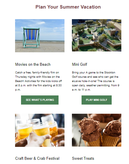
Not making it scannable
Think like a newspaper editor when it comes to your content’s layout: You want a headline, text, and an exciting image. You paragraphs should be small, about one to three sentences each. You can also use the inverted pyramid as your guide for your layout where you draw people in and guide them down the page. Other popular layouts include the zig-zag and column style.
[Insert photo: inverted pyramid]
Keep in mind that more than half your subscribers, about 68% actually, are most likely reading your email on their smartphone and you’ll want to design your emails for their smaller screens.
Not checking for errors
Have you run your content through a spell checker or re-read it for any typos or errors? Have you clicked on all of the links or buttons in your email to make sure they’re working and going to the right place? Have you sent a test version to yourself?
Make sure to do a thorough check of your email before sending it to your subscribers.
No action
Don’t make your subscribers guess what they’re supposed to or why you even sent them an email. Use strong CTAs to tell them what they should do next, like read your latest blog or book your limited time offer.
No contact information present
Have you included links to your social media sites, your website, and provided your phone number and address? Make your contact information available, whether in the footer or in the header. Also, not that you want to encourage people to unsubscribe, but to comply with email laws you must have an unsubscribe option available.